How do you do uses cookies to enhance your online experience. By using this website you agree to our Cookie Policy.
menu
Create an Impactful Logo For Your Brand?
How to
same time as a quick shower
Rob Duncan
Creative Director & Partner at Mucho
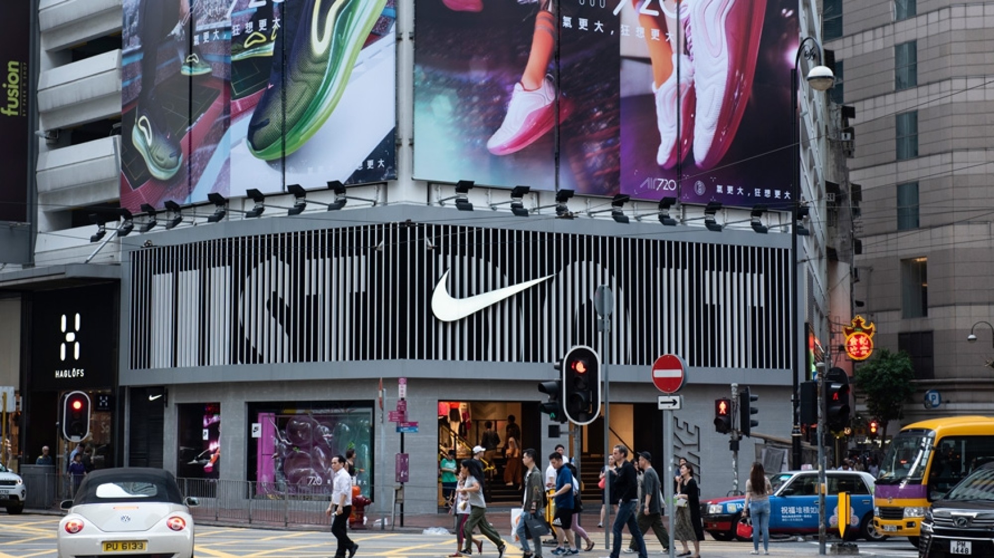
One of the most recognizable logos in the world is the Nike ‘swoosh’. You would think mad men-esque executives at a famous advertising agency in New York City created this iconic logo designed in 1971.
But the real story is quite different. It was designed by graphic design student Carolyn Davidson, who was paid a mere $35 for the job.
Brand logo design has been a booming business long since then, with brand identity pricing ranging anywhere from a couple of thousand dollars to as much as $1,000,000 or more, depending on the project. So why is having a good logo so important, and costly? Even more intriguing, which factors make a logo impactful, and just like the Nike swoosh logo, iconic?
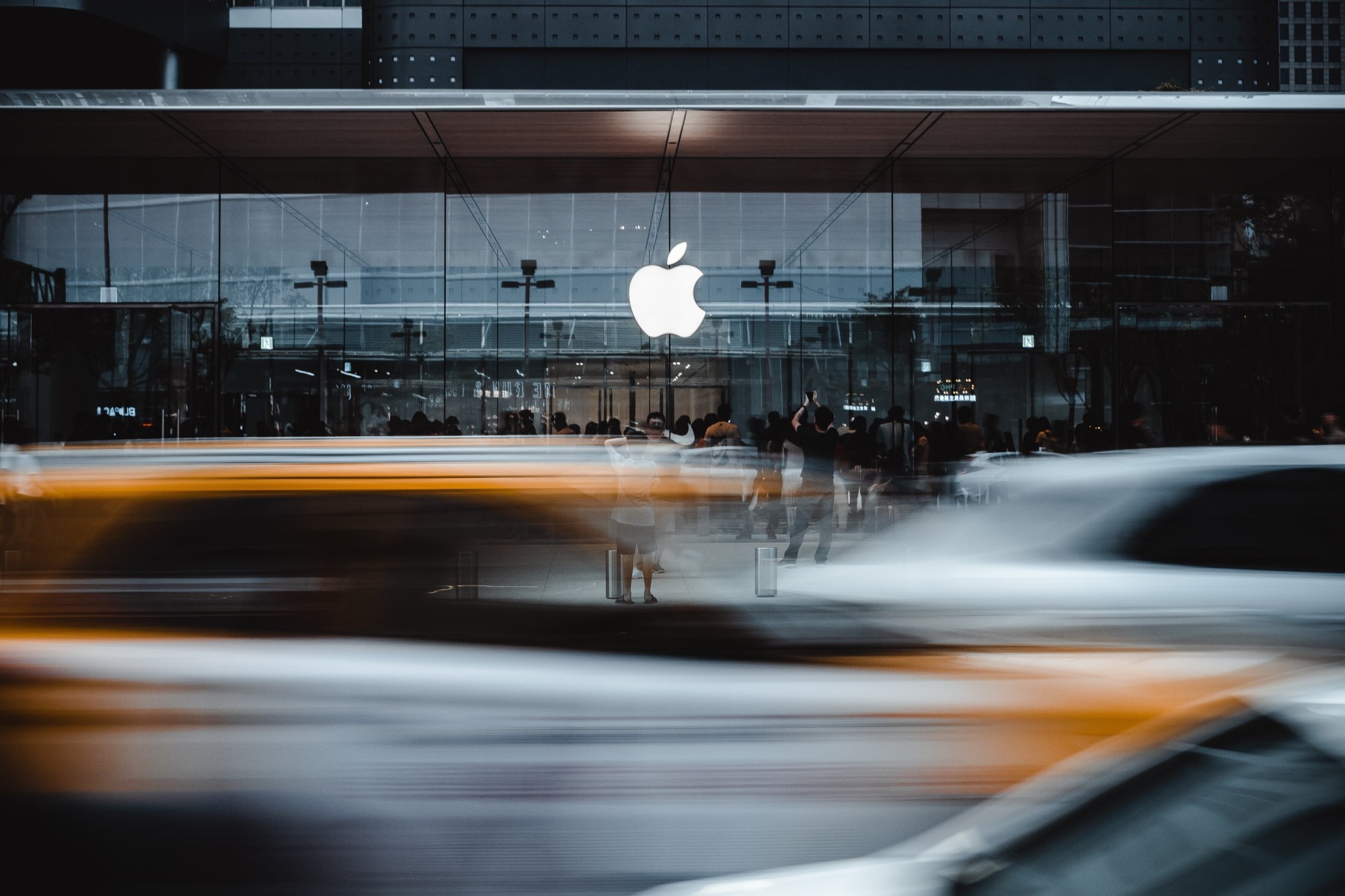
We fired all these questions at Rob Duncan, an expert in the field. Starting his career at Mytton Williams in the UK, he later became a Senior Designer at Pentagram and an Art Director at Apple before founding the office of the Brand Design Agency Mucho in San Francisco.
How do you tell a brand’s story?
‘Brand identity’ is defined as the visible elements that distinguish a brand, including the logo. This set of elements portrays a certain image in the minds of consumers. Some companies mistakenly think a logo is all they need. Or, as Rob Duncan can attest, they often try to incorporate everything they want to say with their logo alone.
Rob Duncan:”We never work with companies that come to us for only a logo. Many times we have to educate clients about the role of a logo. It’s one very important part of a brand, but the messaging also tells your story. Just like the photography or illustration style, typeface and color palette all talk about a different part of the narrative. How everything works together will tell your unique story about who you are as a company.”
That said, companies sure shouldn’t underestimate how important the logo is either. Rob Duncan: "All great designers understand that a brand isn’t just about the logo. However, I believe the logo is one of the most important elements that helps to establish or refresh a great brand. Agencies who dismiss the importance of the logo usually aren’t very good at designing logos!”
What makes a logo so important, is how one idea about the brand is instilled in it, communicating it in the simplest way. Moreover, the very first representation of a brand is often the logo.
Thinking about how people interact with brands now, especially on social media, the logo of a brand needs to work as a tiny icon as an avatar. And it has to say something about the company in that very small space.
Rob Duncan:”That’s very hard to do, so it’s very satisfying when it’s done well. Also, if there is a clever “gift” in the logo, it connects with people on more of an emotional level too.”
How do you find “the gift”?
To create a great logo, a designer must listen to the brand first. To truly understand what makes them stand apart from their competition. There is usually another company in the world that does virtually the exact same thing, offering almost the exact same service. The job as a designer is to uncover what makes them special and different.
Bob Gill (one of the original founders of Pentagram Design) writes in his book ‘So Far’:
“If the job is for a dry cleaner, go to the dry cleaner. And stay there until you have something that you honestly think is interesting to say about that dry cleaning. Research the subject as if you know nothing about it. Don’t look for inspiration in design books. Don’t sit at your computer, waiting for lightning to strike.”
While working at Pentagram Design in London, John Rushworth taught Rob Duncan how to look for ‘the gift’ when designing a logo. The perfect idea that cleverly and simply talks to the values of the company, or the service they offer. In doing this the logo feels inevitable — It really couldn’t be anything else. To find this perfect idea, you have to listen to the client/company, asking them questions.
Rob Duncan:”Be the devil’s advocate replying “Yes, but this other company does that, and this company does that too” and then when you really discover that unique thing that the company does, the next step is to incorporate that into the overall brand identity system, as well as the logo”
All this field research is one of the reasons that make quality logo design so costly, as the dry cleaner would need to pay for that person to sit in his company every day, as often as necessary — his travel expenses, accommodation, and food, in addition to general research and strategy expenses.
This is before the cost of the specialists on top. The designers, copywriters, illustrators and so on, who possess the valuable knowledge and years of experience to know how to translate that research into a logo and brand that makes an impact.
How do you make sure a logo makes an impact?
The world of marketing, design and branding sees many short-lived and long-running trends. Yet certain creative approaches are so effective they remain timeless. While some great logos are more about communicating the gift, others are based on a clever idea. However, if you can combine these two approaches, that’s the real magic!
Some logos are just a name in a beautiful font, and some logos are just an illustration of something. But as Rob Duncan explains, a logo with something clever in it connects with you more. Maybe you won’t notice it at first, but once you see it, it has that “oh wow, how clever!” effect.
Rob Duncan:”I always say great branding is like a great stand-up comedian. There’s this punchline, the joke, that you know is coming. Then when it’s said there’s this aha moment, and you feel like you are participating in this moment, wanting to tell somebody else that joke too. It’s the same with branding; taking something we already know that’s familiar, and giving it a twist to point it out to us in a unique and clever way really makes it memorable”
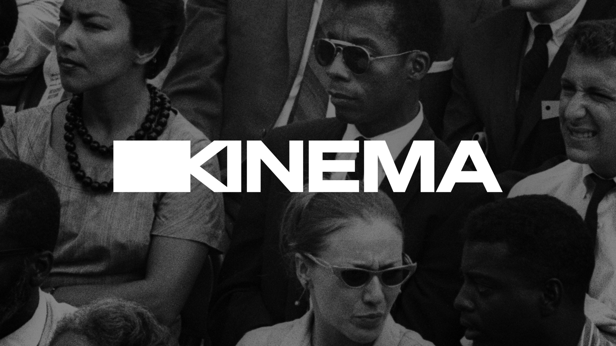
Mucho designed the logo for Kinema, a social cinema platform that became popular during the pandemic as it allowed people to watch movies together online, and comment in real time. The gift and clever idea are how the ‘K’ and the ‘I’ are worked together into the shape of a film camera, which tells you what the company does and can be used as a small icon too.
The FedEx logo is a great example, as there is an arrow in the negative space. Many people don’t realize this, but when it’s pointed out to them, there’s that aha moment that raises a smile, connecting with you emotionally.
Then there are also logos that are a rebus, which means they are exactly what their name says. For example, the Shell Petrol logo is a shell, and the US store Target’s logo is a target.
Rob Duncan:”These are really good logos, that are just a given. When we have a brand with a name that can be an object, it’s one of the first ideas we come up with and try to push through. Because you simplify everything down about that brand, you don’t even have to have the name of the company there”
Another favorite example of a rebus for Rob Duncan, is the logo of technology company Apple, where he worked as an Art Director alongside Steve Jobs. “The Apple logo is very, very good. An original version of the existing logo didn’t have the bite taken out of it, therefore being perceived as a cherry. Adding the bite helped it looked more like an apple, because this gave it a sense of scale.”
No need to spell it out, Apple’s logo is an apple.
How do you make sure your logo is multi-purpose?
So, you now have your logo with that clever twist, or the gift. Maybe a logo that even combines these two approaches, or a rebus! But what else should be considered when designing a great logo?
In the case of Nike, Carolyn Davidson knew it had to look good on the side of a shoe, or on a baseball cap or t-shirt. And as for the Apple logo, it had to be suitable to be etched or embossed onto a metal.
But whatever the product is, Rob Duncan underlines that the big idea about instilling a company’s values or what they do as a business into the logo, should always come first, before thinking of all the different applications or versions of it. Even in the digital, animated environment we live in today.
Mucho designed the logo for Piedmont Art Walk, a neighborhood walk route where artists put on shows/art in front of houses or their garages. The gift and clever idea are how the word ‘art’ seems to walk, telling you exactly what it is, while also having a fun and approachable vibe versus the elitist image art in museums often has. Plus, the animated version of the logo literally walks!
It definitely hasn’t gone unnoticed that all logos move these days. Some agencies however design the animated aspect of the logo before the static version. Later, they often discover that it won’t work as a still version in one color, or very small as a social media avatar either.
Rob Duncan:”The best agencies and logo designers think purely about the simple, static version first. Even if you plan to show a logo in two colors, it has to work in one color too. So keep it simple and create a static logo with that gift or clever idea first, then think about how to animate it and make it come to life in a digital environment.”
How do you create a logo that is iconic?
With the Nike logo being around for over 50 years now, one can see it has all the right things that make it work. It looks like a checkmark that says ‘correct’ and stands for positivity. A swoosh with movement and fluidity. But are these the things that made it become so iconic?
Not from the get-go, according to Rob Duncan:”Many companies say “we want our companies’ logo to be iconic”. But I can’t create something iconic, you only become iconic over time. You need a logo that says one thing about your company in a simple way. Whether that be your values or what you do, and then over time, the meaning and everything your company stands for will get imbued in that logo and it will become iconic.”
In order to stand the test of time, this means a logo would have to be a timeless design that doesn’t follow temporary styles or trends too much. The last thing you want to do as a company is change your logo every 5 years. Starting over again means that all that good equity you acquired can be lost.
Mucho designed the logo for the rebranding of Visa, as the company wanted to be known for its accessibility by everybody anywhere in the world, not just as a credit card company. The gift and clever idea are demonstrated by separating the bars from the word, creating an equal sign that stands for accessibility and equality – A symbol they already had since 1960.
Rob Duncan:”You can always tweak it, refresh it, or perhaps colorize it in different ways. But you need to create something that looks like it could have been done 50 years ago, and looks like something that will still look relevant in another 50 years.”
And this totally makes sense. The Nike logo wasn’t iconic instantaneously, but it had that clever idea, the checkmark reflecting the message of motivation and positivity that people grew to identify Nike with. With the timelessness of the design, more than 50 years later, it’s now seen as an iconic logo.
Have a look at some of the logos that are Rob Duncan’s personal favorites below:
The logo for the National English Opera, Created by CDT. The way the letters are positioned kind of makes it look like a face, with the ‘E’ and ‘N’ as the eyes and the ‘O’ like the opera singers’ mouth open. Rob Duncan:”You might not notice the resemblance right away, but when you do it’s definitely that “Aha!” moment.
The logo for the Victoria & Albert Museum in London. The clever idea is how the ampersand makes the cross part of the ‘A’. Rob Duncan:”It’s a typographic piece of genius. This logo should never be replaced, I really hope it never happens.”
 Create an Impactful Logo For Your Brand?