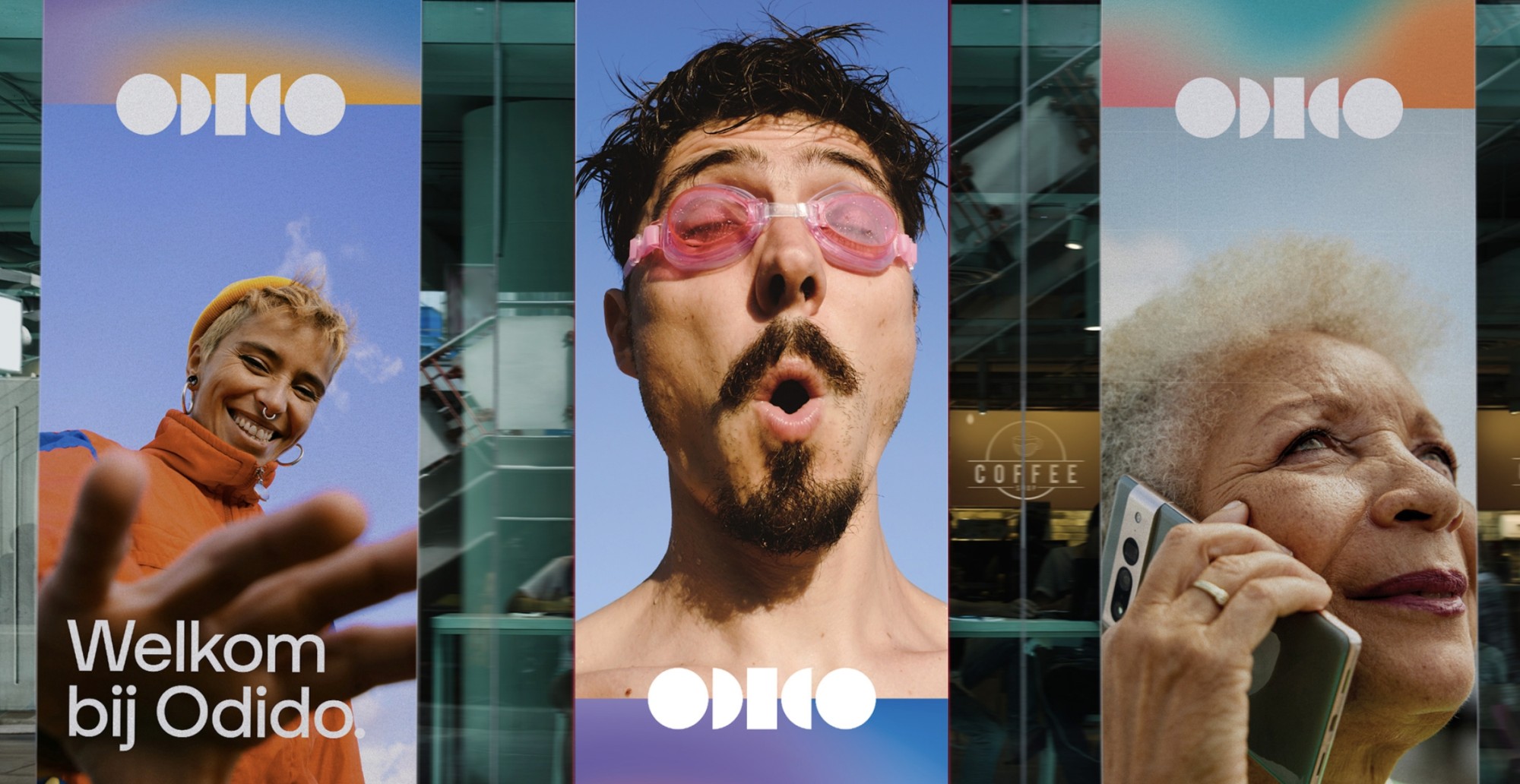
As telecom giants T-Mobile and Tele2 secretly joined forces under the new name Odido, customers were greeted by an unfamiliar provider gracing their mobile screens after the bombshell launch. Simultaneously, employees arriving at work found storefronts that had completely transformed overnight, unveiling the brand-new name and appearance.
A team of 100+ creatives from 9 different agencies joined forces to make the top-secret brand overhaul a huge success. How did such a large team of different agencies manage to navigate a complex project like this, keeping it under wraps until the official launch?
Paulus Nabbe, Creative Director of branding and marketing agency Think Yellow, looks back on the project with fondness, peeling back the curtain on the exciting experience and challenges involved.
How do you divide a huge project among multiple agencies?
Besides main agency TBWA/NEBOKO, which T-Mobile has a longstanding relationship with, a whole team of creative agencies was hired to execute the elaborate rebranding process behind Odido.
With offices in The Hague and Breda in the Netherlands, Think Yellow is a branding and marketing agency that specializes in ‘design thinking,’ combining creativity, design, and testing to achieve effective results.
Tasked with overseeing the applied design aspects of the project, Paulus Nabbe, Creative Director of Think Yellow, recalls how inspiring it was to switch to a completely different environment for a year and a half.
“Think Yellow works with clients like ING, Port of Rotterdam, and Nationale Nederlanden. Often we take the lead on projects from A to Z, so sharing the load with so many different agencies for Odido was a new type of challenge,” Nabbe says.
Each with different areas of expertise, all the agencies were located in different cities. Even though they were assigned different aspects of the project, a temporary office was set up in Amsterdam where all team members involved could come together to work.
“I’ve had my own agency for 30+ years, so it was a very refreshing experience to switch things up for a while, driving to Amsterdam every day. Suddenly thrust into a new environment, it felt like working at a new agency with all these fresh faces,”
The temporary office ensured communication lines were kept short by meeting face-to-face and keeping track of progress in real-time. Nabbe agrees this was a great decision.
“It’s what made it a success. I don’t think we could have pulled it off the same way otherwise. Some brand-building blocks were ready when we started, but some items needed further development. Sharing a workspace together, we saw what everybody was working on, making decisions, and switching gears on the fly.”
With offices in The Hague and Breda in the Netherlands, Think Yellow is a marketing and branding agency that specializes in ‘design thinking.’
How do you ensure effective collaboration with so many teams?
Did it ever feel like there were ‘too many cooks in the kitchen’ with that many agencies together? A room full of art directors is a room full of egos and opinions, Nabbe admits. But fortunately, it turned out to be a smooth joint effort with a lot of room for input and ideas.
“Even though TBWA/NEBOKO largely defined the brand identity, it didn’t feel like it was just their show. We all had our own clear roles. During weekly design reviews, we discussed everyone’s perspectives in a very open atmosphere. Of course there were some spirited discussions, but overall it went really well. I met so many lovely people, all super positive and motivated to contribute their expertise.”
With some brand building blocks still underdeveloped, the weekly design reviews were crucial in defining the next steps, and who would do what. Nabbe explains that naturally, many things arose that nobody had thought about beforehand, and open collaboration allowed everyone to jump in when new tasks came up.
“We ended up doing so much more than initially expected. Our main task was producing a huge number of design assets in the new brand identity, but in the process, we ended up defining a lot of the underdeveloped brand elements too, such as the infographic style and the color grading of the photography”
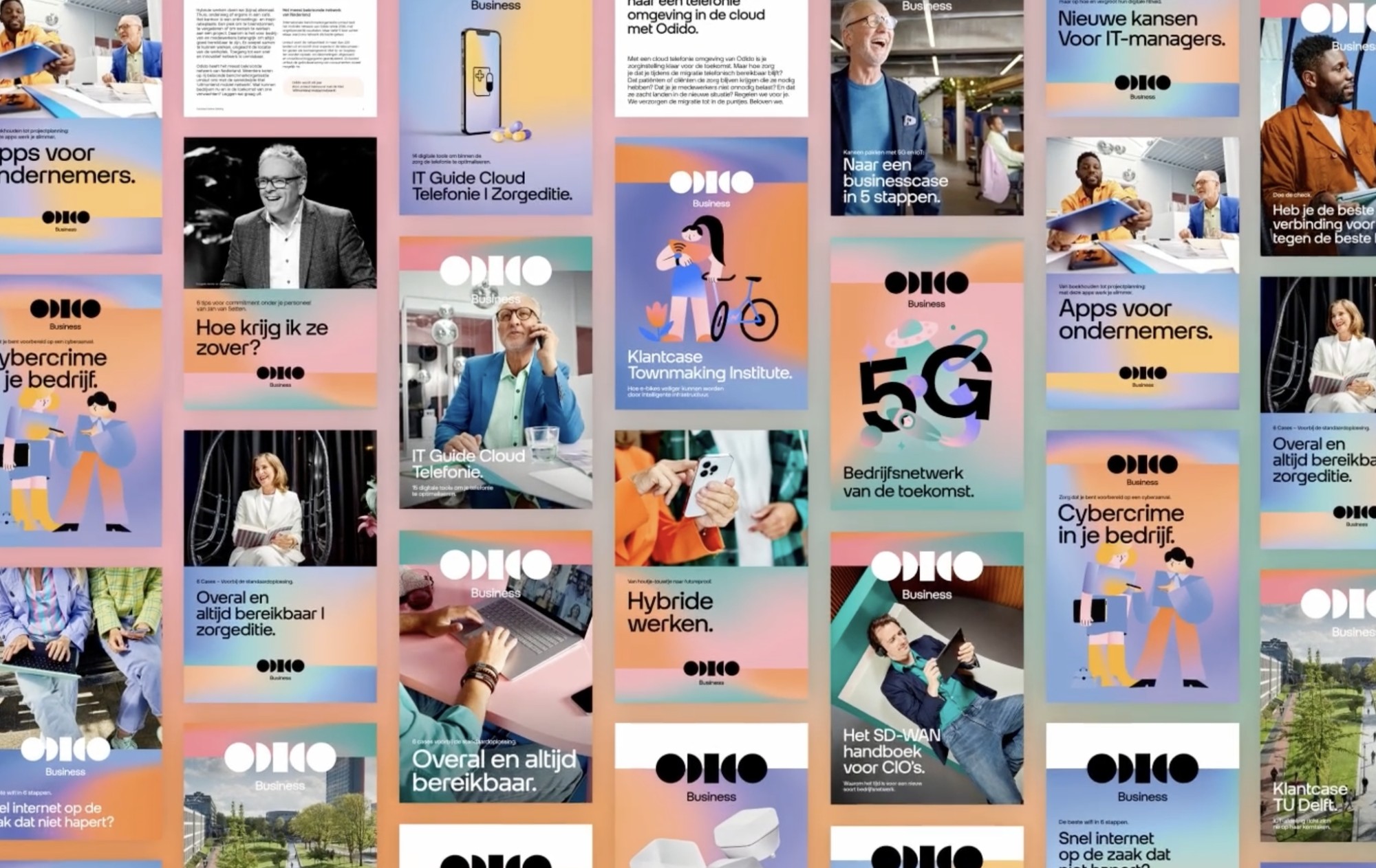
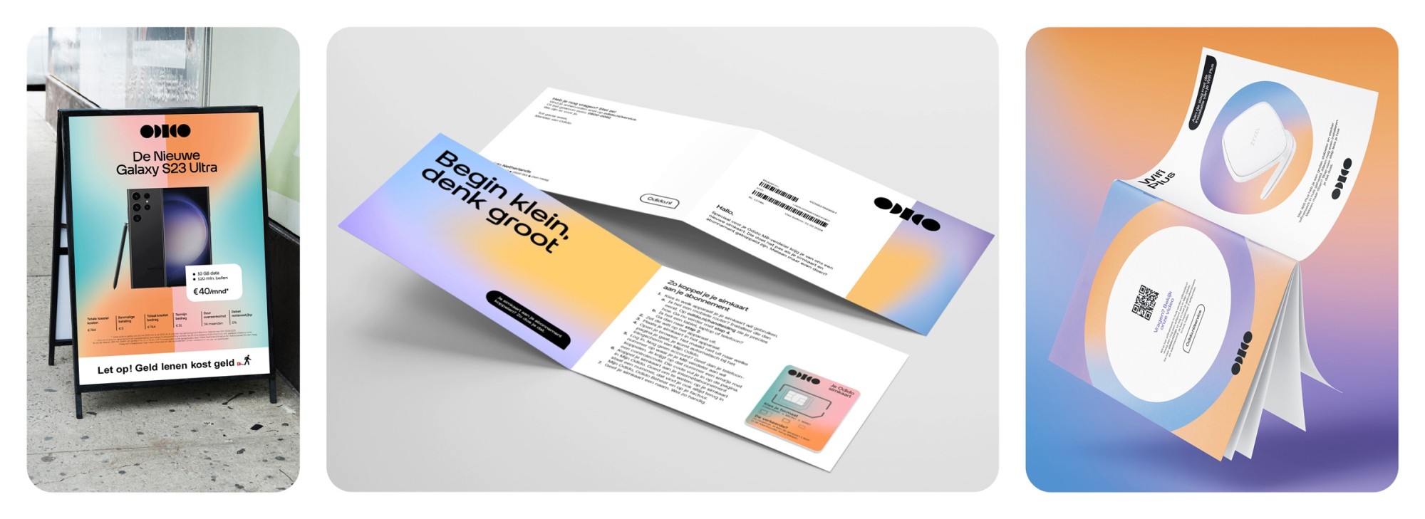
A selection of brochures developed by Think Yellow for Odido, incorporating various color glows, logos, photography, and graphics.
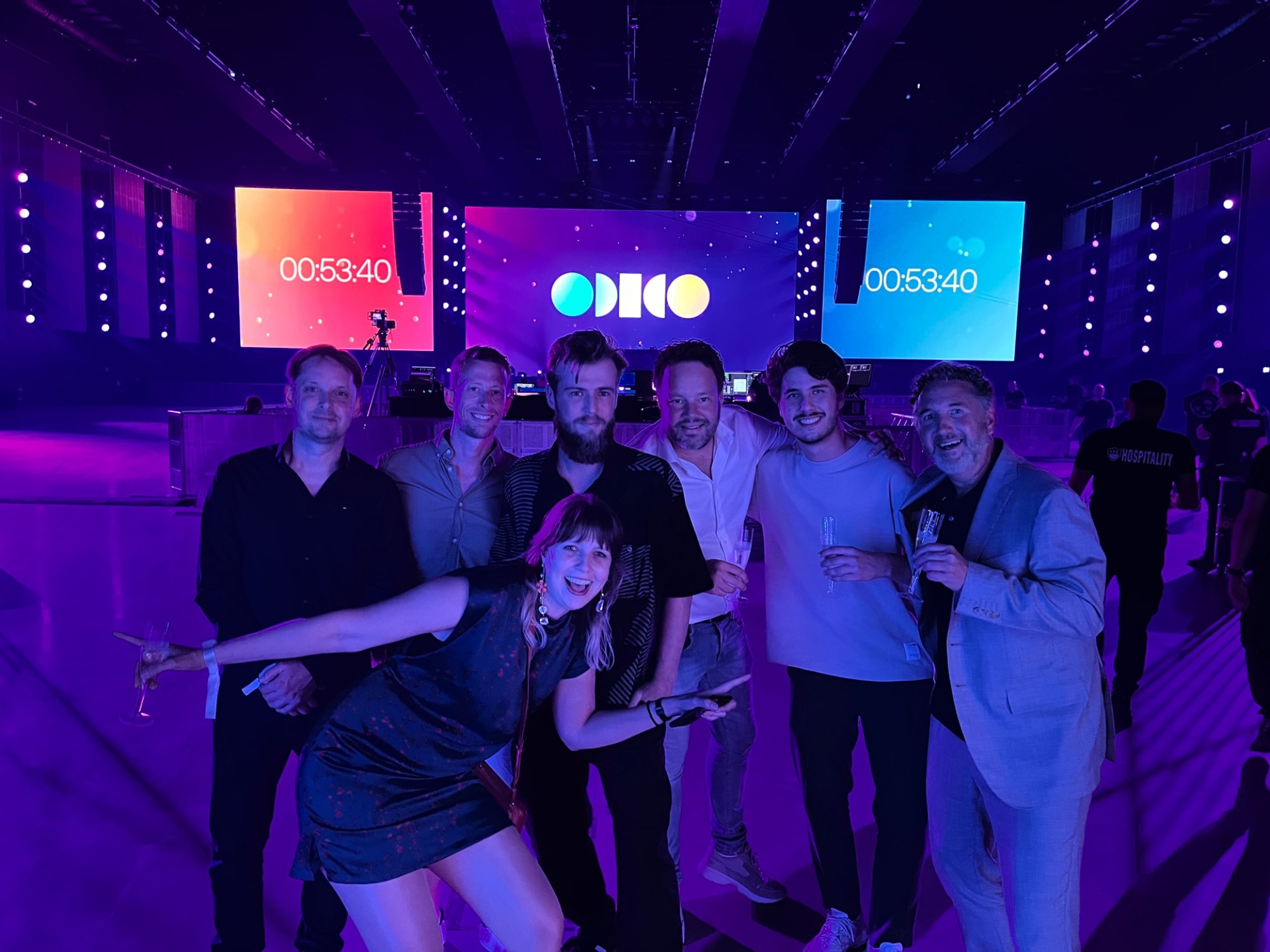
The cherry on top was taking care of Odido’s big launch party in Ahoy Arena in Rotterdam, which arose last minute when something happened with the company initially hired to handle it.
“We took care of the visual elements such as the banners, the way-finding, the digital signage, and all the animations and graphics for it. It was a welcome last-minute challenge that we took head-on.”
The team at the Odido launch party.
How do you fill in the blanks when implementing a brand identity?
Things like the logo, tone of voice, and color palette were ready in an early stage, so some of the simpler brand assets could be produced easily. However, as Think Yellow’s team always works down long lists of different design assets, the challenge lies in developing methods for adapting and applying the brand building blocks appropriately.
“This is Think Yellow’s strength, we really know how to work with brand identities and their specific ‘rules,’ and how all the brand building blocks should fit together,” Nabbe said.
Odidio’s brand colors include specific ‘glows’ (gradient color effects), but the photography initially didn’t match these specific hues until Nabbe defined the color grading format for this.
“And that’s the process you keep going through,” Nabbe continues. “Brand identities have a lot of ingredients. You’re working with icons, colors, illustrations, photography, and typography, and they are applied a certain way on various corporate identity carriers. TBWA already thought about many things well, but in the application to online and offline communication carriers, you still come across all kinds of things to solve.”
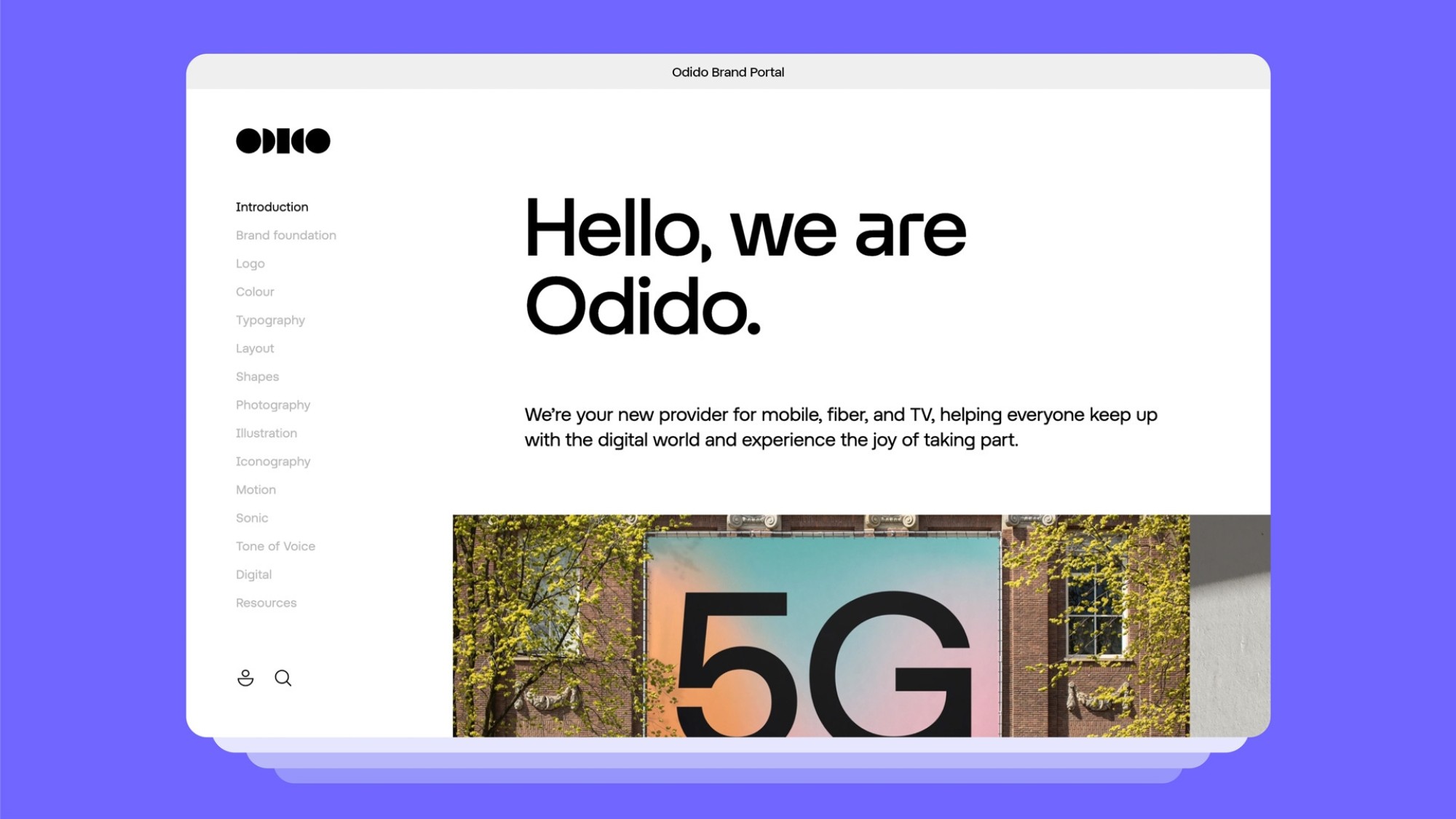
Brand portal design for Odido’s website
The difficulty in developing all these methods and formats depends on the complexity of the brand identity. Simple brands use only one or two colors, using the same font for everything. Developing design assets is much easier when there aren’t a lot of ‘rules’ to consider.
But Nabbe explains that brand identities with just a few ingredients can be quite boring, often all looking the same. Brand identities with a lot of ingredients are much more creative and therefore much more complex.
“Odido has a very complex brand identity, with a lot of fun ingredients. And that’s exactly what sets the brand apart, emanating positivity, with a certain liveliness and playfulness to it.”
Different brand design assets produced by Think Yellow.
How do you keep a project secret until the launch?
Odido’s launch came as a huge surprise to everyone, as the teams were contractually bound to keep everything under wraps until the very end. This was yet another reason why the temporary office was absolutely imperative.
Leaving virtually no room for mistakes, T-Mobile and Odido were always referred to by code names “Millen” and “Elloh,” even at the office. “Whether in meetings or writing emails, we could never slip up by mentioning the real names,” Nabbe reminisces.
“It was quite daunting at times! In my entire 30-year-long career, I think I might have signed an NDA once or twice, but I never experienced anything to this extent. I couldn’t even tell my family. My son worked on my Odido design team, so he knew. But my daughter had no clue what we were working on all those months,” he adds.
Sometimes the strict confidentiality measures complicated things in unforeseen ways. The invoices sent by the agencies during the project had to be addressed to an anonymous client with a fake logo, for example.
“But this secrecy is exactly what compelled us to work so closely together, making it extra special and unique. The launch party felt like a huge release after finishing the project. We had all been looking forward to finally enjoying a beer together, to celebrate what we achieved together.”
The result? A surprising brand launch that completely redefines the telecom branding landscape with Odido; the ‘premium for all’ telephone provider that is inclusive, positive, and focuses on customer service with a personal, down-to-earth touch.
 Keep a Top-Secret Rebranding Project Under Wraps?